The first thing a customer touches is the package. Your packaging design is your opening argument in a crowded market, a silent salesperson working in a sea of competitors. In fact, Ipsos found that 72% of American consumers report a product’s packaging design influences their buying decisions.
Good packaging does the hard work of selling when no one’s around to pitch. It makes people trust you before they’ve tried you. The truth is, packaging design directly influences buying decisions through visual impact, emotional triggers, and brand perception, often in ways shoppers don’t even realize.
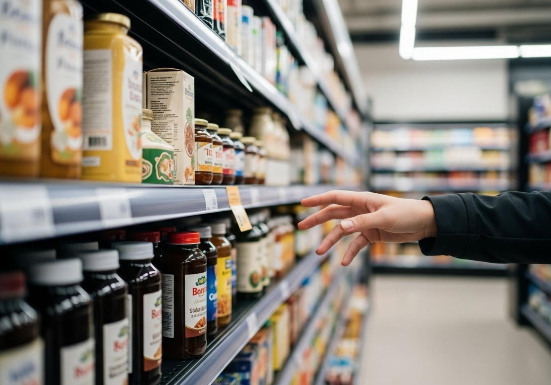
First Impressions Matter

Seven seconds. That’s the window you get. This is the “7-second rule,” the brief moment where consumers make fast, subconscious judgments based entirely on visuals. Your packaging has to grab their attention and make its case. Instantly.
To do this, designers deploy visual hierarchy. They put the important stuff where your eyes naturally land first. A clear hierarchy is a key factor in the influence of packaging because it makes a product easy to understand. Picture the cereal aisle as a wall of visual noise. The boxes that stand out have a clear focal point. Your eye knows exactly what the product is and who makes it. This cognitive ease translates directly to purchase ease.
But catching someone’s eye is just the beginning. Once you have their attention, you need to make them feel something.
Emotional and Psychological Triggers
Good packaging gets noticed. Great packaging makes you feel something. This is the core of packaging psychology, where packaging design choices trigger specific, often subconscious, emotional responses. Every element works together to create an instant emotional reaction that happens before logical thought kicks in.
Color works faster than words. But colors don’t just grab attention; they mess with your head in specific ways:
- Red: Makes everything feel urgent, like a deadline approaching
- Blue: The banker’s handshake of colors, steady and reliable
- Green: Your brain assumes “healthy” before you even check what’s in it
- Black: Costs more just by being black
Then there’s the shape of things. Round edges make products seem approachable. Sharp corners feel more serious or technical. Coca-Cola uses its iconic script and contour bottle to evoke happiness and nostalgia. Apple, in contrast, uses clean, minimalist boxes to communicate innovation and premium quality before the device is even powered on.
These emotional connections become even more powerful when they’re consistent. Each time a customer encounters your packaging, those feelings get reinforced, gradually building into something stronger: recognition.
Brand Identity and Recognition

People start recognizing your style after seeing it a few times. Consistent colors and fonts help customers remember you. Regular shoppers can find your products quickly because they know what to look for. Familiar colors and logos help people find you again without searching the whole store. When your packaging stays consistent, customers learn to spot you from across the aisle. That familiarity turns into preference, and preference into loyalty.
The ultimate example? Tiffany & Co.’s iconic blue box. That particular blue became famous on its own. People recognize the box as luxury even without seeing the jewelry. This is packaging and branding at its finest. The packaging isn’t just part of the brand; for many, it is the brand.
But people need more than just familiar colors. If they don’t believe what’s inside matches what’s outside, they walk away.
Informational Clarity and Transparency
People expect brands to be upfront about their products now. When labels are hard to read or seem misleading, customers lose interest quickly. Simple ingredient lists and clear facts work better than complicated marketing speak. Shoppers look for familiar certifications as shortcuts to find products that match their values.
The data is unforgiving: 94% of consumers are more likely to be loyal to a brand that offers complete transparency. Third-party certifications like USDA Organic act as reliable signals, giving them the confidence they need to make a purchase.
Clear information builds trust, but the physical package itself sends its own message about what’s inside. The materials you choose say more than any product claim.
Quality Perception

Hold a flimsy plastic container next to a weighty glass jar. Without opening either, you already know which one costs more. The same wine tastes better from a heavy bottle than a light one. Your brain connects weight with worth before you take a single sip.
Premium packaging convinces shoppers to pay premium prices. The signals work at a glance. Thick cardstock feels expensive in your hands. Matte finishes catch light differently than glossy ones. A magnetic closure clicks shut with satisfying precision. Each detail adds up to an impression of value that has nothing to do with what’s actually inside.
Of course, perceived quality means nothing if the package fails in real life. The moment someone struggles to open your product, all that premium positioning evaporates.
Practicality and Functionality
Beautiful packages that fail at home poison your brand. That impossible-to-open plastic shell? Customers curse it every time. The bag that won’t reseal? They switch brands on their next shopping trip. Function matters as much as form because the relationship with your packaging extends far beyond the purchase moment.
Smart packaging solves problems shoppers didn’t know they had. Heinz created the Dip & Squeeze packet that works both ways. Method made cleaning bottles people actually want to display on their counters. When designing effective custom packaging, successful brands balance looks with real-world use. The best packages work harder after purchase than they did on the shelf.
Today’s shoppers judge functionality through another lens too: environmental impact. A package that works great but hurts the planet is increasingly a deal-breaker.
Sustainability as a Decision-Maker

Among current packaging trends, sustainability isn’t optional anymore. 54% of consumers will pay extra for sustainable options, and that number keeps climbing. Younger shoppers especially see packaging waste as a reflection of brand values.
Ask shoppers what matters most in eco-friendly packaging and they all say the same thing: recyclability. They want to toss it in the blue bin without guilt. Lush went further and eliminated packaging entirely with their “naked” products. Boxed Water turned its recyclable container into the entire brand story. These companies made responsibility profitable.
All these packaging principles apply whether customers shop in stores or online. But digital shopping creates unique challenges and opportunities for package design.
Digital Shelf Appeal (E-Commerce Packaging)

Shopping moved online but packages still matter. Maybe more. Your product photo is the only thing between a browser and a buyer. High-resolution images let shoppers zoom in on textures and finishes. 360-degree views replace the in-store handling test. The packaging has to sell itself through a screen, which means every angle needs to tell your story.
Then comes the doorstep moment. Plain brown boxes waste an opportunity. Glossier figured something out. Their pink bubble mailers get photographed and posted thousands of times. People actually want to show off the packaging. Smart brands realized that every customer with a phone is a potential advertiser. Make the unboxing worth sharing and the marketing happens by itself.
Conclusion
Smart packaging design is an investment that works round the clock. First it stops shoppers in their tracks. Then it convinces them you’re worth their money. Later it sits on their counter, reminding them why they bought you. Maybe it even ends up in their Instagram feed. Every touchpoint builds on the last one.
Businesses must stop seeing packaging as just a cost. Thoughtful packaging design is a critical investment in your marketing strategy and your brand’s equity. It’s one of the most direct tools you have to win over customers. Understanding these principles is the first step. The next is putting them into action. Take a hard look at your own packaging. Is it working as hard as it could be? Are you leaving money on the shelf because your design isn’t doing its job?
Frequently Asked Questions (FAQs)
Why is packaging design important in marketing?
Packaging is the first impression your product offers. Before customers read a single word or touch your product, they’re already forming opinions based on how it looks. Good packaging grabs attention in crowded stores and convinces people to pick up your product instead of the competitor’s.
How does color influence packaging design?
Colors hit people on an emotional level before they even realize it. Red makes things feel urgent. Blue builds trust. Green suggests something healthy or natural. These reactions happen automatically, which is why smart brands pick colors that match the feeling they want customers to have.
Can packaging design really affect sales?
Absolutely. Studies show that most people have bought something new just because the packaging caught their eye. When you’re competing for shelf space, good design can be the difference between getting noticed and getting ignored completely.
What elements make packaging more appealing to customers?
Good packaging catches your eye but also works when you get it home. People notice clean designs that make sense. Quality materials matter too. Nobody wants something that feels cheap or falls apart.
How does sustainable packaging influence buying decisions?
Plenty of shoppers notice eco-friendly packaging these days. They’ll happily pay a few extra dollars when a brand shows it cares about the planet too.
How does packaging help build brand identity?
Consistent colors and designs are how people remember your products. Shoppers will start recognizing your style after seeing it a few times. Good brands become easy to spot on crowded shelves.
What is the role of packaging in e-commerce?
Your packaging works double duty online. It has to sell through product photos first, then create an unboxing experience worth sharing. Smart brands turn their shipping boxes into marketing tools that customers actually want to photograph and post.
What role does typography play in packaging design?
Fonts affect how people see your brand. Fancy scripts look upscale. Bold letters seem strong. Fun fonts appear friendly. The right choice helps communicate your personality.
How can packaging influence impulse purchases?
Bright packages break the shopping autopilot. You weren’t planning to buy it, but suddenly it’s in your hand. The package short-circuited the part of your brain that makes lists and sticks to them.
What are common mistakes to avoid in packaging design?
Too much information creates confusion. Tiny fonts annoy everyone over 40. Packages that require scissors make people angry. And when every product looks different, customers can’t find you twice.